Mobile Development Toolkit
Nov, 30This is a syndicated post. Read the original at Noupe Design Blog » TUTORIAL2010-11-30.
  
|
Mobile web design has been around for quite a while. Unfortunately, a lot of mobile design guidelines are out of date and focus on low-resolution, non-touchscreen phones. Despite their popularity, there isn’t a whole lot of information out there for designing websites for the new generation of smartphones (iPhone, Android devices, BlackBerry touchscreens, etc.) — these devices are growing more and more popular in Europe and North America.
Below are some fantastic resources for designing not just mobile websites, but smartphone-friendly sites. We’ve covered everything from basics to tutorials to usability. If there are other resources you’ve found useful, please share them in the comments.
Development Basics
The articles below give a great introduction to designing for mobile devices, plus more in-depth information. There are both basic, theory-driven articles as well as more technical tutorials.
Designing a Mobile Stylesheet for Your Website
This article from Speckyboy Design Magazine goes in-depth into what you need to consider when creating your mobile site design. It covers everything from allowing for fluctuations in your layouts to hiding awkwardly-proportioned content for your mobile visitors.

In Depth: How to Make Your Website Mobile Compatible
This article dives into the specifics of mobile site development, including topics like device detection and testing.

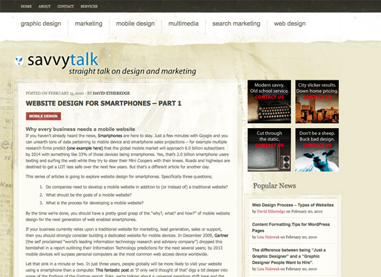
Website Design for Smartphones – Part 1
This 3 part series from Savvytalk covers all the basics for creating a site optimized for smartphones; also why you’d want to develop for smartphones and how to actually do so.
Tutorial: Making Your WordPress Blog Android and iPhone Friendly
This tutorial gives in-depth instructions on how to make your WP blog show up properly on iPhones and Android devices, without using plug-ins. 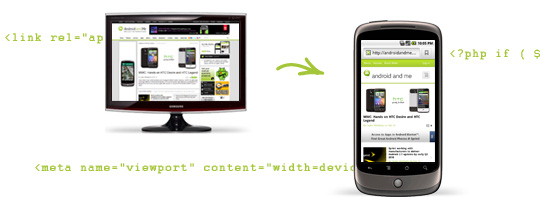
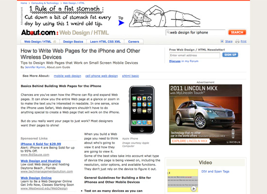
How to Write Web Pages for the iPhone and Other Wireless Devices
This page from About.com talks about the basics of designing sites for smartphones like the iPhone. It’s a good primer for what you need to consider before you actually start designing.
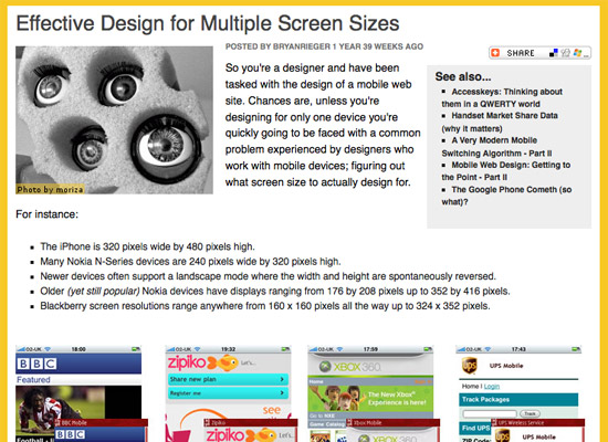
Effective Design for Multiple Screen Sizes
This article from MobiForge talks about some things to keep in mind when designing mobile websites for multiple devices, with multiple screen resolutions. Considering that smartphone screen sizes can range anywhere from a couple hundred pixels square up to the iPhone’s new retina display; it’s a big concern for designers.
How To: Make Your Mobile Websites Act More Like Native Apps
This Mashable article offers a number of tools for making your mobile website act more like a native application on mobile devices.

Styling Submit Buttons for Mobile Safari
Here’s a brief tutorial from Think Vitamin about how to style your buttons so they appear correctly in Mobile Safari, including code.

Tutorial: Optimizing Your Website for Mobile Devices
This tutorial shows you how to create a smartphone version of your website that’s based on the regular version. It re-uses elements from the original design to create a site that reinforces your branding and create a unique mobile experience that doesn’t look like just another mobile template.

10 Tips for New iPhone Developers
This article gives in-depth information about creating web apps for the iPhone that work like native apps.
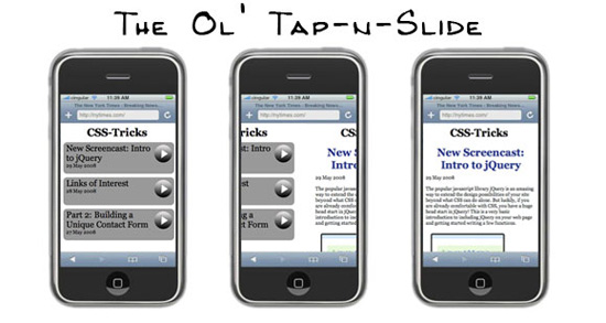
Create a Slick iPhone/Mobile Interface from any RSS Feed
This tutorial from CSS-Tricks shows you how to use your site’s RSS feed to create a slick smartphone interface. The end result is highly usable and has extra flair that’s often missing from mobile sites.
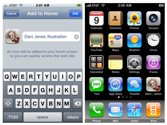
How to Make Your Portfolio iPhone Compatible
This tutorial gives complete instructions for how to make an existing portfolio site work on the iPhone. It even includes instructions for creating a webclip icon, so if users make your site a webclip, it won’t just use a generic screenshot as the icon.
Create an iPhone Optimised Website Using jQTouch
Here’s a complete tutorial for creating a smartphone-optimized website using jQuery’s Mobile library. Full code is included.

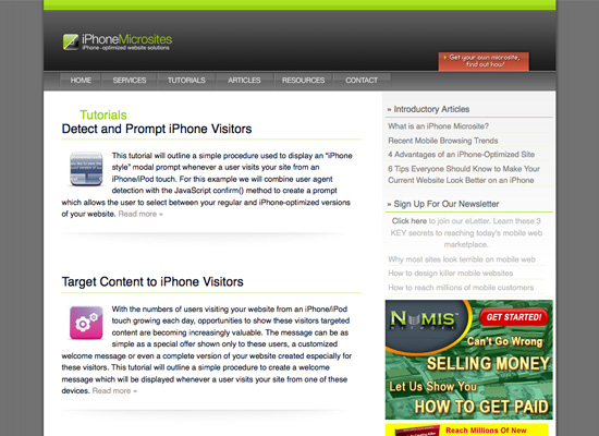
iPhone Microsites – Tutorials
This site offers a ton of tutorials for creating iPhone optimized and targeted microsites. Tutorials include how to target content specifically to iPhone visitors, tips for using inline images and also how to create a touch-based sliding UI.
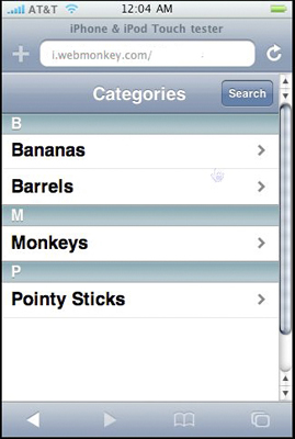
Build an iPhone-Optimized Website with iUI
This tutorial from Webmonkey teaches you how to optimize your website for iPhone visitors using Joe Hewitt’s iUI.
Mobile Web Design: Best Practices
This article from Six Revisions is a great primer for what you need to know when designing for mobile devices. It covers everything from the complications that arise due to different delivery methods to the specifics of structure and code for your mobile site.

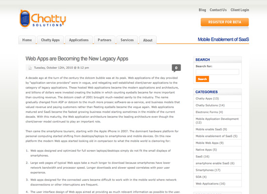
Web Apps are Becoming the New Legacy Apps
This article talks about the problems many web apps face in regards to being used on smartphones, and what app creators need to do to be more smartphone-friendly.
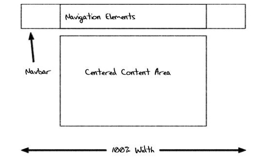
8 Ways to Make Your Website Mobile Friendly
Design Reviver discusses a variety of ways to make your existing website more friendly to mobile devices. It includes tips about fluid layouts, centered content, short pages, and more.
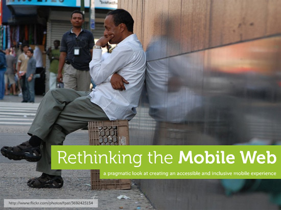
Rethinking the Mobile Web
Here’s a brilliant slideshow from UX Magazine that talks about how to approach mobile web design so that it’s accessible on the largest number of devices (not just iPhones or Android phones).
Usability
Usability on smartphones is vital. Usability on the full version of your website might not necessarily translate to good smartphone usability. The articles below can help you fill in the gaps.
Usability Tips for Smartphone Websites
Here’s a brief article that covers usability considerations specific to smartphone website design. It talks about things that aren’t considerations with traditional web design, like leveraging native device capabilities.
Mobile Usability
This article from Jakob Nielsen talks about mobile usability, why it stinks, and how designers and developers can start to make it better. It includes data from real-world studies to back up the claims it makes.
7 Usability Guidelines for Websites on Mobile Devices
This article covers seven basic usability guidelines you should keep in mind when developing mobile sites, based on real user research. Covered are things like not repeating navigation on every page and using mobile-friendly page layouts. It’s aimed at general mobile development, but the principles also apply specifically to smartphones.
5 Can’t-Miss Usability Tips for Mobile Website Designs
Here’s another post with some great specific tips on mobile site usability, though this one definitely focuses more on smartphones.

A Three Step Guide to Usability on the Mobile Web
This article includes not only steps for improving usability, but also a download link to a PDF best-practices guide for mobile development.
Mobile Usability Testing
Here’s a slideshow that gives an overview of what goes into usability testing for mobile sites.
Development Kits
When creating mockups, it’s sometimes helpful to see your design as it might actually appear on a smartphone screen. The GUI kits and other tools here will help with that.
Perfect Multi-Column CSS Liquid Layouts – iPhone Compatible
This site provides a number of CSS-based liquid layouts that work with the iPhone’s browser. They use no JavaScript, no CSS hacks, and no images.

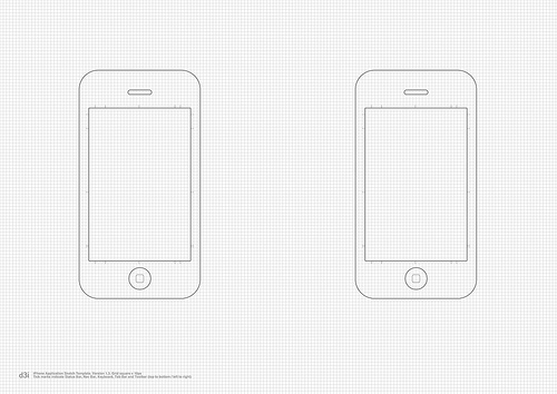
iPhone Application Sketch Template v1.3
This printable iPhone template is great for wireframing mobile sites, and includes a grid for accuracy.
RIM BlackBerry PSD
Here’s a free BlackBerry UI template kit PSD file. It has 135 layers included for all aspects of the BlackBerry UI.

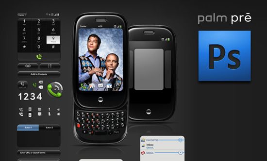
Palm Pre GUI PSD
Here’s a PSD file with a variety of Palm Pre UI elements, free from Teehan+Lax.
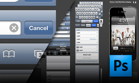
iPhone 4 GUI PSD (Retina Display)
Now that the iPhone 4 has a higher-resolution retina display, it’s important to use GUI templates that reflect the higher resolution.
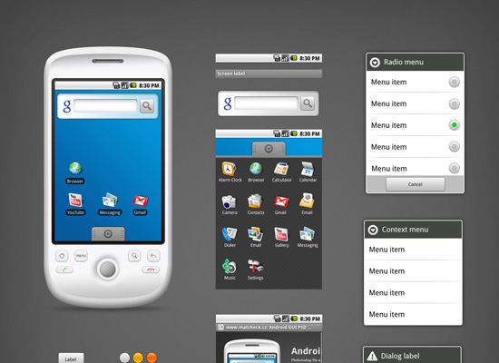
Android GUI PSD Vector Kit
Here’s a free Android vector GUI kit with resizeable elements for creating mockups in any size you need.
Testing
You’ll need to test your mobile site to make sure it’s going to appear as you intended. Here are a couple tools to help:
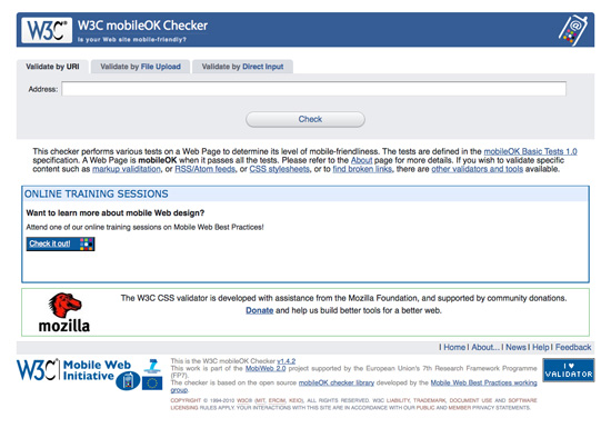
W3C mobileOK Checker
It’s important that your mobile website is W3C compliant, as it makes it more likely to display across a variety of devices and less likely to break as technologies change (just like it is for regular websites).
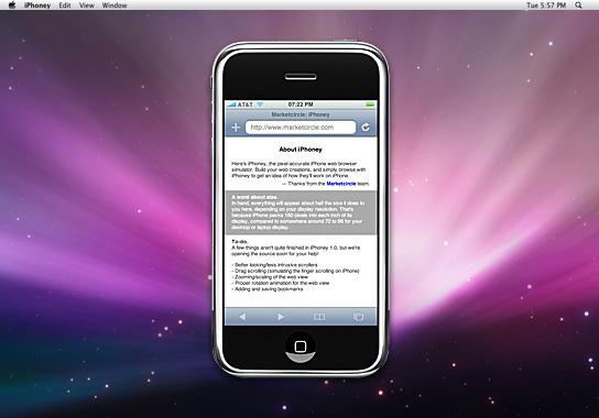
iPhoney
iPhoney is a free iPhone simulator from Market Circle. It uses Safari and offers pixel-accurate rendering of web pages. The only downside: it still uses the 320 x 480 pixel canvas, rather than the new retina display size.
10 Awesome Design Examples
What would a roundup of awesome smartphone design tools and resources be without some examples to help inspire your own designs? The designs below are all exceptionally well-done and show just how a smartphone-optimized site should look.
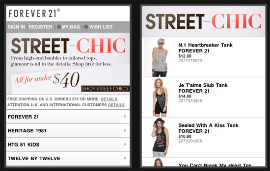
Forever 21
Forever 21, a clothing retailer for young women, do a great job of optimizing their site for mobile viewing. Their navigation is simplified, they put promotions on top but don’t fill the entire screen with them, and include a store locator.
Bloomingdale’s
Clothing retailer Bloomingdale’s places their store locator link prominently on the mobile home page.

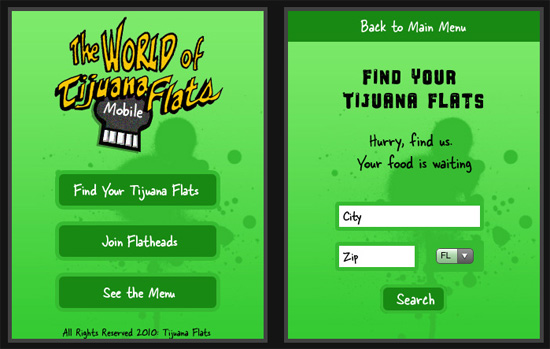
Tijuana Flats
Tijuana Flats has obviously what mobile visitors are most likely to want to see: the menu and the restaurant locator, and they place links to each front and center.
Babcock Partners
This is a very polished and professional mobile design, with a simplified navigation and strong visual elements.

Plank
Web design firm Plank has a great mobile site that emphasizes what they do and is very usable.

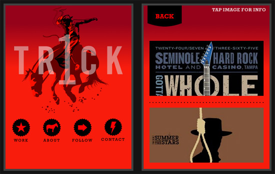
1 Trick Pony
1 Trick Pony removes navigation on sub-pages on their mobile site, instead opting for a simple “Back” button. It’s a great way to unclutter your design but only works well for sites that don’t have deep navigation.
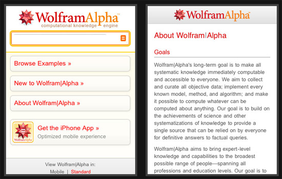
Wolfram Alpha
Wolfram Alpha’s mobile site is a simplified version of their full site, with the search bar right up top.
Alex Buga
Alex Buga has done a fantastic job of echoing their full site while optimizing it for a mobile browser window. Keeping the same graphic style and using elements of the full design works exceptionally well and reinforces brand identity.
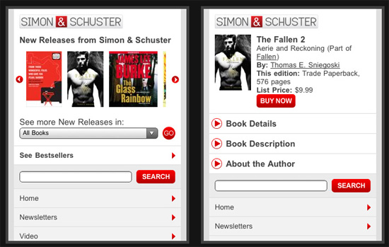
Simon & Schuster
Simon & Schuster probably has one of the more complex mobile site designs listed here, yet they still keep it very usable. Featured content is prominently displayed, as are options for finding other content.
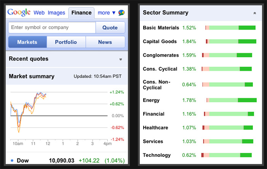
Google Finance
Google Finance maintains a very uncluttered, almost minimalist layout that makes information most likely to be of interest to users easily accessible.
Conclusion
Smartphone design is growing more important on what seems like a daily basis. As more and more people switch to smartphones or upgrade to more powerful versions, smartphone optimization for websites is going to be vital to the success of any website or web-based business.
(ik)
What a sad looking blog post!
Please add some comments.
Add A Comment